
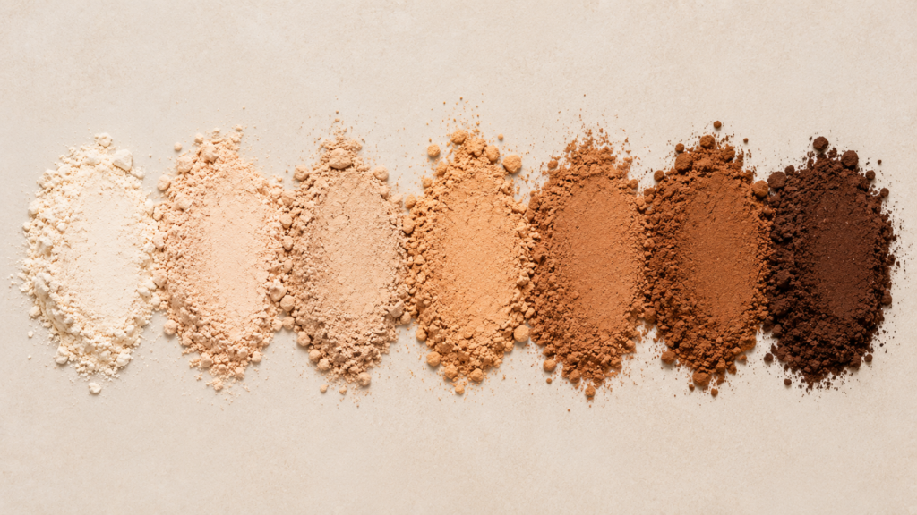
Color Matching in Cosmetics: A Practical Intro to Pigment Blending
Matching a color swatch sounds like it should be straightforward — until you try to replicate a shade in an actual cosmetic base and discover it looks different wet, different dry, and different again once applied to skin. Color in cosmetics isn’t just about pigment ratios; it’s about how pigments behave inside a specific formula.
Warm undertone
Neutral undertone
Cool/pink undertone
The Core Pigment Categories
Most cosmetic color systems are built from a small set of pigment categories, combined in different ratios:
- Iron oxides (red, yellow, black) — the workhorse pigments for skin-tone matching in foundations, concealers, and color cosmetics; opaque, stable, and widely regulatory-approved across major markets
- Titanium dioxide — provides opacity and lightening; also functions as a UV filter, giving it a dual role in tinted sun care
- Mica-based pearls/pigments — provide shimmer, sheen, and optical effects rather than flat color; layered on top of a base shade rather than replacing it
- Lakes and dyes — used for more saturated, vivid colors (lipsticks, blushes) where iron oxides alone can’t achieve the needed chroma
Why Undertone Matters More Than Shade Depth
Two shades can have identical lightness/darkness but completely different undertones — warm (yellow/orange-leaning), cool (pink/red-leaning), or neutral. Undertone mismatch is the single most common reason a “close” color match still looks visibly wrong once applied, because human perception is highly sensitive to undertone even when overall depth is correct.
In practice, this means color matching isn’t a single-axis problem (light to dark) — it’s at minimum a two-axis problem (depth and undertone), and skilled formulators typically build a base palette that lets them adjust both independently rather than mixing from scratch for every new shade.
Why a Color Doesn’t Match the Same Wet, Dry, and Applied
This is where a lot of first-time formulators get tripped up. The same pigment blend can read differently at three separate stages:
- Wet/liquid state — pigment particles are dispersed and refract light differently than in a dried or set film
- Dried/set state — as a formula’s vehicle (water, oil, or solvent) evaporates or sets, pigment concentration effectively increases and light scattering changes, often shifting the visual shade
- Applied to skin — skin’s own undertone, texture, and oil production interact with the applied pigment layer, and formula opacity/coverage level determines how much of the skin’s natural color shows through
A shade that matches a target swatch in its raw, wet state can shift noticeably once it dries down or is blended into skin — which is why color matching has to be validated at the actual point of use, not just at the mixing bowl.
A Practical Approach to Building a Shade
- Start with a base ratio — most iron-oxide systems start from red, yellow, and black oxide ratios, adjusted against a white/titanium dioxide base for depth
- Match depth first, undertone second — get the lightness/darkness in the right range before fine-tuning warm/cool balance; adjusting both simultaneously makes it harder to isolate what’s actually off
- Evaluate at the actual end state — always assess color match after the formula has fully set/dried and been applied at realistic thickness, not in the mixing vessel
- Account for base opacity — the same pigment blend will read differently in a sheer, semi-transparent base versus a fully opaque one, since skin undertone contributes differently to the final visual result
The Takeaway
Pigment blending is chemistry and perception working together — getting the ratios “correct” on paper doesn’t guarantee a correct visual match once the formula is applied in its real end-use context. Building in undertone flexibility, and always validating color at the actual point of application, is what separates a formula that matches a swatch from one that actually looks right on skin.
Streamline shade development with FunColor, our free color formulation tool built for cosmetic product developers.
